

 See My Latest Article on HelloNation
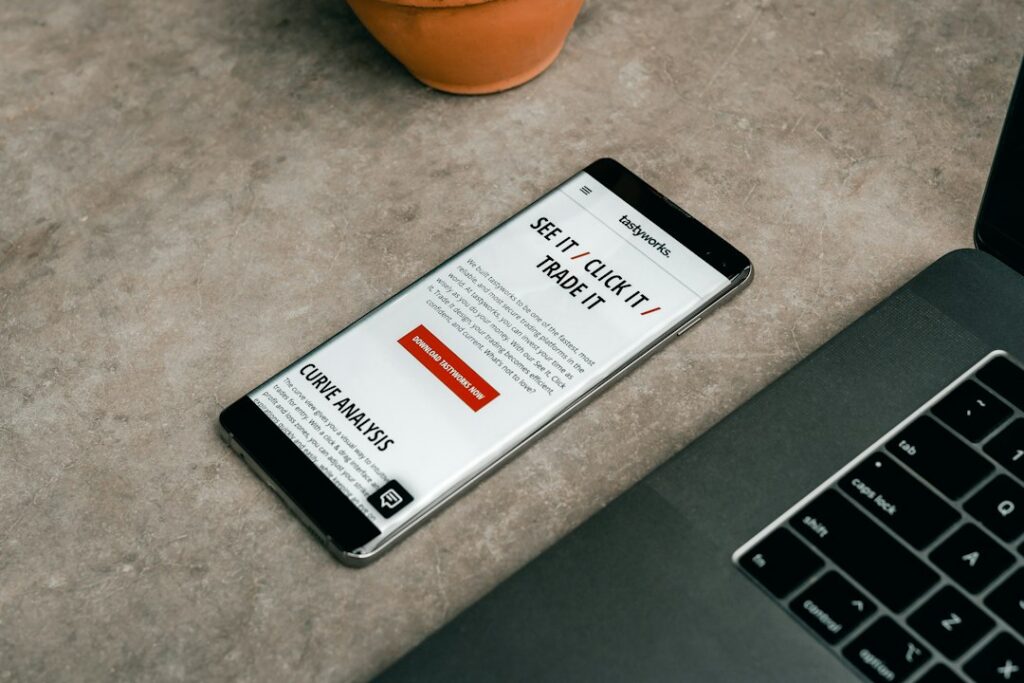
What makes an email newsletter engaging?
An engaging email newsletter is clear, useful, and easy to scan. It gives readers a reason to open the message, helps them find important information quickly, and respects their time.
For residents, households, and community groups in Charleston, WV, a good newsletter might share local updates, educational material, event information, seasonal reminders, or practical resources. The subject matter can vary, but the basic design principles remain consistent.
A strong newsletter usually includes:
- One clear purpose
- A recognizable sender name
- A short, specific subject line
- Useful information near the top
- Scannable sections
- Readable text on mobile devices
- Links that explain what happens next
- A simple way to manage email preferences
The goal is not to include everything. The goal is to help readers understand what matters most.
How should a newsletter be organized?
Most newsletters work best when the most valuable information appears first. Readers often skim rather than read every word, especially when checking email on a phone.
A practical structure might look like this:
1. Opening message: Briefly explain the main purpose of the email.
2. Primary update: Present the most timely or useful item.
3. Supporting information: Add related details, tips, or background.
4. Secondary items: Include shorter updates that do not require as much attention.
5. Closing details: Provide contact information, preferences, or administrative notices.
Each section should answer a reader’s likely question. For example, if the newsletter discusses a seasonal community event, readers may want to know what it is, when it occurs, where to find more information, and whether preparation is required.
Avoid placing several equally prominent headlines at the top. Too many competing elements make the newsletter feel crowded and can leave readers unsure where to begin.
What should the subject line say?
The subject line should describe the newsletter accurately and create a clear expectation. It does not need to sound clever to be effective.
Useful subject lines often include:
- The main topic
- A relevant time period
- A practical benefit
- A clear announcement
For example, “October Updates: Fall Home Preparation Tips” is more informative than “Your Latest News.” A subject line such as “Three Ways to Prepare for Colder Weather” tells readers what they will find inside.
Avoid excessive punctuation, vague claims, and wording that sounds urgent without a reason. Misleading subject lines may produce an initial open but reduce trust over time.
The preview text, which appears near the subject line in many email applications, should add information rather than repeat the same phrase. Together, the subject line and preview text should summarize the newsletter in plain language.
How much text belongs in an email newsletter?
There is no universal word count, but each section should be only as long as necessary. Short paragraphs, descriptive subheadings, and meaningful spacing make longer material easier to use.
A useful editing test is to ask:
- Does this sentence help readers understand the subject?
- Is the information current and relevant?
- Can the point be stated more simply?
- Would a heading or bullet list make it easier to scan?
- Should this detail be placed on a separate webpage instead?
Long explanations can be appropriate when the subject is complicated, but the newsletter should provide a useful summary before directing readers to additional information. Readers should not have to search through several paragraphs to find the main point.
How can a newsletter be made easier to read on a phone?
Mobile readability depends on both writing and layout. A design that looks balanced on a large screen may become difficult to use on a phone.
Use:
- Large enough text for comfortable reading
- Strong contrast between text and background
- Short paragraphs
- One-column layouts when possible
- Buttons or links with enough space around them
- Images that resize without breaking the page
- Headings that clearly separate topics
Do not place important information only inside an image. Some readers may have images turned off, and screen readers may not interpret visual text properly.
Links should also be descriptive. “Read the winter preparation guide” gives more context than “Click here.” Descriptive links are easier to understand for people scanning the message and for readers using assistive technology.
Should a newsletter use images?
Images can make a newsletter more welcoming, but they should support the message rather than compete with it. A relevant photograph, diagram, or simple illustration may help readers understand the subject.

Use images selectively. Large files can slow loading, especially for people with limited connectivity or older devices. Every meaningful image should have alternative text that briefly describes its purpose. Decorative images can often use empty alternative text so they do not distract screen-reader users.
For a local audience, images may reflect familiar seasonal conditions, neighborhood settings, household activities, or community life. However, visual details should be accurate and should not imply information that the newsletter does not actually provide.
How often should an email newsletter be sent?
The right frequency depends on the amount of useful information available and the expectations set when people subscribe. A predictable schedule is generally easier for readers to understand than irregular bursts of messages.
A newsletter may be sent weekly, twice a month, or monthly if each edition contains meaningful material. More frequent messages may be appropriate for time-sensitive updates, but sending too often can lead to fatigue and unsubscribes.
The signup process should explain:
- What type of information readers will receive
- How often messages are expected
- Whether different topics can be selected
- How readers can unsubscribe or change preferences
Permission is not a one-time matter. Readers may change their interests, and a respectful newsletter makes those choices easy to manage.
What common newsletter mistakes should be avoided?
Several design problems make a newsletter harder to trust or use.
Too many topics: A message that covers every possible update can feel unfocused. Group related information and remove items that can wait.
Unclear sender identity: Readers should be able to recognize who sent the message and why they are receiving it.
Weak hierarchy: If every headline, button, and image has the same visual emphasis, nothing appears important.
Unedited announcements: A newsletter should not simply copy a long notice without explaining why readers should care.
Broken or outdated links: Check links before sending and review recurring newsletters regularly.
Low-contrast design: Light text on a pale background may look stylish but is difficult for many readers.
No testing: Send a test message to different devices or email applications. Check spacing, links, images, subject lines, and accessibility before distribution.
How can local context improve a newsletter?
Local relevance works best when it changes the usefulness of the information, not merely when a place name is added. In Charleston, seasonal weather, hills and travel routes, older housing, varied internet access, and household routines may affect how readers use practical information.
For example, a seasonal newsletter might explain how changing temperatures affect home maintenance, transportation planning, outdoor activities, or community schedules. A digital guide may also need to account for readers who use phones as their primary internet-connected device.
Local context should be specific but not overdone. Readers are more likely to value a newsletter that recognizes real conditions in the community than one that repeats the city name without adding useful detail.
How can newsletter performance be evaluated?
Useful evaluation focuses on reader behavior and feedback rather than a single number. Open rates can provide a general signal, but they do not fully explain whether the content was helpful.
Other questions include:
- Did readers click the most important link?
- Which topics received the most attention?
- Did people read the message on mobile devices?
- Were there delivery failures or broken links?
- Did readers unsubscribe after a change in frequency or format?
- What questions did readers ask afterward?
A short feedback prompt can reveal problems that statistics cannot. For example, readers may understand the subject but find the instructions unclear, or they may prefer fewer sections with more explanation.
The most effective improvements are usually practical: clearer subject lines, shorter introductions, better headings, fewer competing links, and content that matches the expectations established at signup.